This week’s Summer Tech Camp session was focused on Google Fusion Tables, and I had planned to post detailed instructions and other information today. Those plans are on hold for the moment, though, because I’ve been mysteriously locked out of Fusion.
Oh, technology.
In the meantime, here’s a story from Poynter.org that explores some of the challenges of finding solid electronic information. Just like in any other kind of journalism, your final Fusion project will only be as good as its data. No amount of fancy styling can make up for inaccuracies.
Of the networks surveyed, MSNBC was the most likely to feature female guests during the month of April — but they were still outnumbered by men two-to-one. MSNBC was also the most racially diverse, which isn’t saying much considering that 73 percent of its guests were white.
The results are even more depressing when viewed in the context of national demographics:
While white men enjoyed representation on cable that was nearly double that of their representation in the U.S. population, white women, who represent 32 percent of the population, were only 21 percent of guests on cable. Non-white women fared even worse. While they make up 19 percent of the population, they were only 8 percent of all guests on cable. Non-white men were also underrepresented; only 13 percent of guests on cable were non-white men while they make up 18 percent of the population.
Also interesting: The gender balance didn’t shift much when the host was female. This differs from a study by the 4th Estate Project that found female reporters working for National Public Radio were more likely to interview female sources.
Matt Carroll, the Boston Globe’s data guru, gave one of my classes a tutorial on Google Fusion last week. It was pretty awesome.
Carroll called data visualization an “exploding field” with a shortage of qualified journalists. (Hear that, student journos? If you want a job you should learn a bit about data or at least spreadsheets.) I had hoped to post a vizzy of my own, but I’ve been bogged down in other projects these last few days. Instead, here’s a roundup of some impressive data visualizations I’ve seen lately:
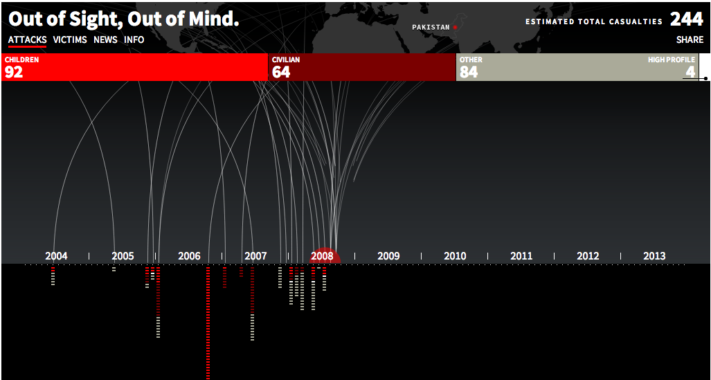
In this interactive graphic, The Guardian breaks down drone strikes in Pakistan since 2004. Photo/guardian.co.uk
The Guardian’s Datablog is always amazing, but this animated, interactive look at drone warfare in Pakistan is in a class by itself. The designers used data from the Bureau of Investigative Journalism to illustrate the demographics of the more than 3,000 people killed by American drone strikes in Pakistan since 2004. The information is complex, but the design remains simple. A quick look shows how strikes became more frequent — and more deadly — after President Obama took office in 2009. Closer inspection reveals details about each attack.
Like the drone project, this graphic from the Associated Press is structured around a timeline. It uses colored circles the cost in terms of money and life of wars throughout American history. The AP published it today to mark the 40th anniversary of the end of American involvement in the Vietnam War. It’s simple, timely and contextualizes historic events.
ProPublica is packed with vizzies, including a few sophisticated enough to be reporting tools in their own right. One of my current favorites is this graph of where members of Congress stand on gun regulation. It’s a calm, clear look at an emotional topic. At first, I found all the little pictures distracting, but I came to appreciate them after playing with the graphic for a few minutes.