When it comes to class planning, I’m rather obsessive. I have white boards in my office, a couple of spreadsheets on my hard drive and a notebook for each course I teach. I write detailed memos to my students and myself, and I spend a few days at the beginning of every semester wrestling Blackboard’s grade book into something that resembles order.
But, sometimes, it’s fun to toss all of that aside and just riff. That’s what I did today with a dozen of my journalism students here at UNH. My inspiration was Storybench.org, a new collaboration between Northeastern University’s Media Innovation program and Esquire Magazine. (Disclosure: I received my MA from Northeastern last year. More disclosure: I remain a UNH hockey fan.)
Storybench is as useful as it is gorgeous, jam packed with techniques culled from the front lines of digital creation. Headline generation! Google Maps! Charts and graphs galore! The site formally launched yesterday, and I knew I had to use it in class right away.
Even without a plan.
We’re near the end of the semester up here, and I’d promised my students something a little fun and little different from the usual rhythm of our writing workshop. I talked about the why and when of telling stories with data and showed them a few examples. While they worked on projects in Infogr.am (which I’ve used for more than a year), I announced I would race them to build something similar using Storybench’s instructions for Charted.co – a new tool I’d never touched before today.
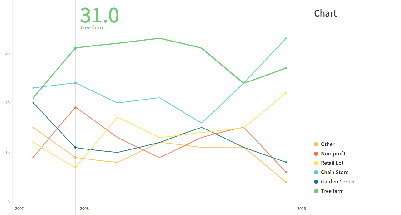
We focused on data about where Americans purchase their Christmas trees. They pasted it into Infogr.am and, before long, were adding pictures and adjusting color palettes.

I spent 20 minutes wresting with Google Drive before giving up and putting the .csv file in DropBox. By the time class ended, this half-baked graph was all I had to show:

But the point of activities like this isn’t necessarily a finished project. What matters is introducing young journalists to the concept of real-time experimentation, showing them that it’s okay to dive into something new without knowing exactly where it will lead.