“Management can’t meet the challenge of discrimination against women by just promoting one or two women to highly visible jobs while the rest of the corporate structure remains a male preserve.” – former Washington Post publisher Katharine Graham while speaking to a group of male business leaders in the 1970s.
Mapping mavens of the web journalism world
Mapping is, without a doubt, an important part of modern journalism. It’s a literal — and often beautiful — manifestation of the sense of place necessary for great storytelling. Maps help us understand complex topics like campaign ad buys, the demographics of the Catholic church and housing discrimination.
So I was rather dismayed to see this tweet come out of the SXSW Interactive conference:
The skills necessary to create maps like the ones I mention above are in high demand at news organizations of all kinds, and Google is a fantastic, non-threatening way to explore the possibilities of geography-based journalism. What does it mean for tomorrow’s newsrooms if women are sidestepping these tools?

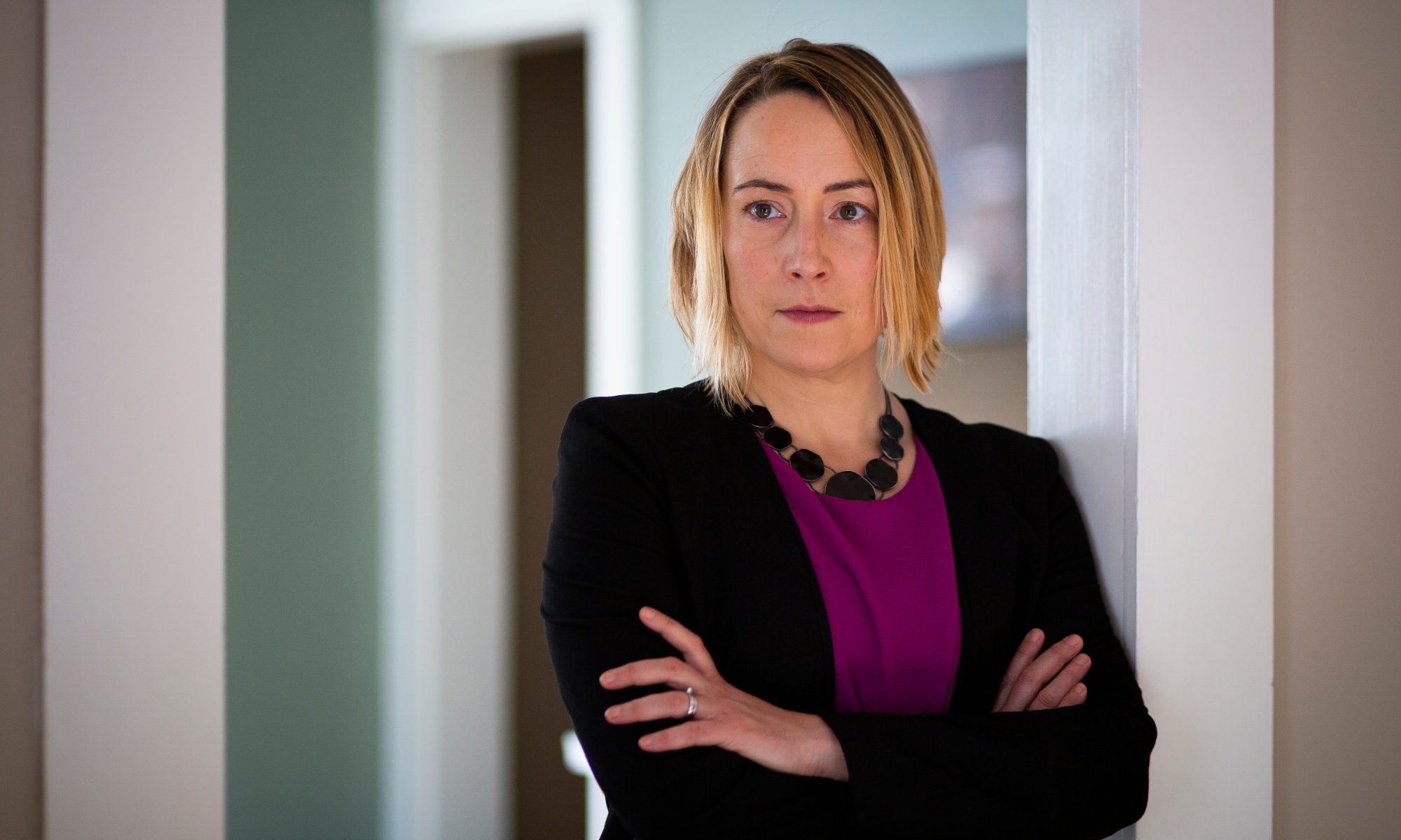
Even journalists with zero interest in building maps of their own must be literate in this kind of storytelling. Michelle Minkoff, an interactive producer for the Associated Press, says mapping requires collaboration among many members of a team. It’s complex, tricky work, but worth the effort.
“If you have a thing you see in your head, given time and resources, there is nothing to stop you from making it a reality,” she said in an email. “It is, then, making dreams come true, in a very literal sense.”
Minkoff and her colleagues used Google maps to track the 2012 presidential election, as seen here on NPR.org. (For more of AP’s interactive work, go here.)
I don’t want this blog to become a collection of “lady who…” stories, but role models are important, so here’s a Twitter list of women who map. And here’s an edited version of an email Q&A with Minkoff:
How important will maps be to online journalism? Why?
As students, we grow up with maps, and I believe they are a visualization type that can be very comprehensible to the general public when used correctly…I can tell you there have been a lot of crime incidents, or you can see the plethora of dots and just how many there are. It’s a whole different angle on using facts. As technology develops, the possibilities explode.
It’s also important to note that forms of visualization are many, and often, just because you CAN map a story, doesn’t mean you should. For more, see here.
What kinds of tools do you use to create maps?
I’m part of a talented team at the AP, and none of the pieces I’m about to discuss would be possible without my collaborators. It’s not about being a woman in tech, but working with a team where we operate on the quality of our work, not external factors.
I spend a lot of time building mapping systems. The focus here is less on building one specific map, than on building computer programs that make it easier for others to make maps. More often, we use one of two systems we’ve created, with various different programs and code libraries. One we call the “shape map”, which are shapes that you fill in on a page. (Here’s an example.)
Often, we fill in the shapes with different colors to represent data. For this, we use ESRI shapes to get the actual data, Illustrator to style those files, Inkscape for further simplification of the shapes and Raphael to render it out on the page. Some internal tools also help this process along. While most of our published shape maps feature the US, we’ve created custom shapes for world countries.
The other type of system we have is our zoomable map. Here’s how AP used it for the impact of Superstorm Sandy. Again, we use ESRI shapes to get the shapes of the world on the map, used Tilemill to style the background map and then the Leaflet library to make it interactive and put dynamic data on the map.
What can we do to get more women interested in tech, both in J-school and in news orgs?
For students and practitioners of journalism, seeing examples of what’s possible, and then understanding how to get there seems like a good route. That means more courses introducing concepts via projects, which then teach concepts. Also, getting people excited about what they can do if they learn code.
Just as importantly, female journalists must be given opportunity to recognize you will not be the only female techy journalist out there. Seek out the others, because there are many of us. And the best part of all is the journalism community is extremely welcoming, and that includes the men. I rarely think about gender on a daily basis, because we’re there to do good work. Always remember the mission of telling compelling stories. That is the end goal.
BBC creates video database of female experts
The BBC is helping its reporters connect with smart, well-spoken women by assembling a database of female experts. According to The Telegraph, the database includes specialists from a variety of fields who have completed a free media training day organized by the BBC.
The ‘expert women database’ contains the details of the 60 women who have so far received free training via these days, as well as the contacts of a further 120 women who “showed promise” in their applications to the BBC Academy. More than 2,000 women applied for the first BBC Academy female expert training day but there were only 30 spaces.
The BBC is one of several British news organizations responding to criticisms about gender imbalances in journalism.
As the Telegraph reports, this isn’t the first database of its kind. My own quick Google search uncovered this directory of female scientists in Eastern Europe. Are there any similar databases in the U.S.? Should someone start one?
