
Measuring women’s participation in journalism once meant sitting down with a stack of newspapers and counting bylines by hand. That’s no longer the case, thanks to computer programs that use big data to examine gender biases in sourcing, story placement and even retweets.
Leap and the net will appear

This is Hamilton Smith Hall, home of the University of New Hampshire’s English department and the journalism lab where I wrote my first ledes. Come January, it will also be the site of my new office.
It’s been nearly a year since I quit a perfectly good job at a great local newspaper to pursue a master’s degree — the credential I need to teach journalism at the college level. It was, without doubt, a big gamble. Higher education is grappling with many of the same disruptions that are rocking newsrooms, but I believe that the best way to serve journalism is to support its future practitioners. So I took the risk — and it’s paid off.
In January, I’ll be joining the UNH faculty as a lecturer in the journalism program. Although I don’t start teaching for a few months, I attended an orientation for new employees earlier this week. The picture above is one of several I took while wandering around Durham Monday evening.
Ham-Smith is one of the oldest buildings on campus, so she’s a little rough around the edges. But it was there, nearly 15 years ago, that this kid from the woods of New Hampshire learned how to understand the larger world through writing. So much has changed since I took that introductory news writing class all those lifetimes ago, but I’m excited to help today’s students shape how stories will be told in the decades to come.
And, of course, watch the Wildcats crush Maine. Often.
A no-frills tool for awesome charts
For our final Summer Tech Camp, we’re tackling Chartbuilder — the simple tool that’s behind many of Quartz’s crisp, useful charts and graphs. As David Yanofsky writes, Chartbuilder has given “everyone in our worldwide newsroom 24-hour access to simple charts at graphics-desk quality. “
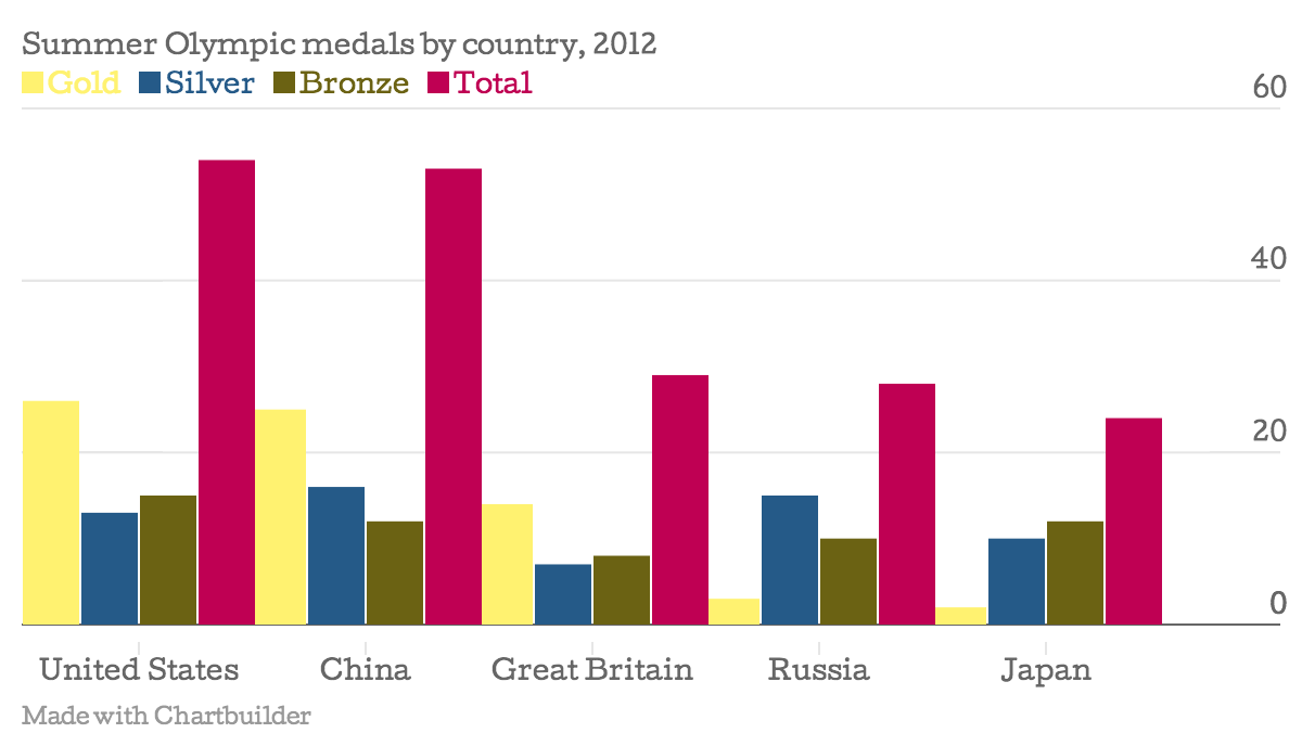
Now, that tool is available for even non-Quartz staffers to use. Here’s a chart I made showing the medal totals by country for the 2012 Summer Olympics:
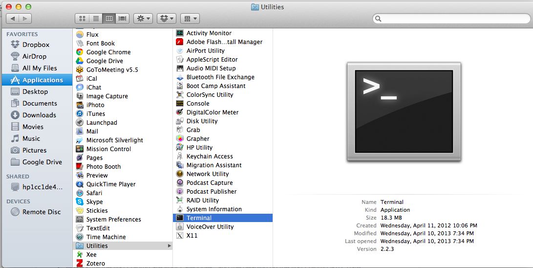
To launch Chartbuilder, you’ll need to enter a few command lines into your computer’s terminal. You’ll find the lines here under “getting started.” As for the terminal, here’s where to look on a Mac:
 PC users, you’re on your own. Just kidding. Try this set of instructions for opening the terminal in Windows 7.
Once you’re in the Chartbuilder interface, try playing around a bit with the pre-loaded data. Once you get a sense of how things work, try adding data of your own. Here are a few sample sets to get you started.
