During last week’s tech camp, we touched briefly on the way data is shaping how stories are told online. Today, we’ll explore that concept more deeply through Google Fusion Tables.
To use utterly unscientific terms, Fusion Tables are souped-up spreadsheets that superimpose — or fuse — information onto Google’s expansive mapping system. The finished products can be saved, shared and embedded on websites. Fusion also allows users to create simple charts, timelines and other data visualizations. Our focus, however, will be on building interactive maps. (Read this for a few reasons why mapping is important to modern digital storytelling.)
Once you learn the basics of Fusion, it’s possible to create a fairly sophisticated project in less than 30 minutes. Still, the process can be a little intimidating at first. Here are step-by-step instructions to help you along, and here are the three things you need for a successful project:
1.) A goal. What do you hope to achieve? What do you want to help readers understand? What do you know? What do you ned to know? Will this be a stand-alone map or part of a broader package?
2.) Valid data that can be manipulated using geography. The simplest example is a list of addresses, like in this table I made showing a few visits to New Hampshire by possible 2016 presidential candidates. Here’s another example that shows the location of stalled construction in New York City.
(A note about validity: Data shouldn’t be treated any differently than other kinds of information we handle as journalists. In other words, verify, contextualize and cite properly.)
3.) Shape files. These are necessary only for projects in which you want to show highlighted geographic areas, as opposed to pins. They contain boundary information for common geographic areas like states, provinces, countries and counties. To see what I mean, check out this project by the Guardian. The pins were dropped using basic address information, while the colored patches relied on shape files for geographic areas. (We’ll cover where to find the shape files and how to make them different colors during camp.)
Finally, here’s the tutorial we’ll be using together on Monday. It’s far less complicated than it looks. Promise!

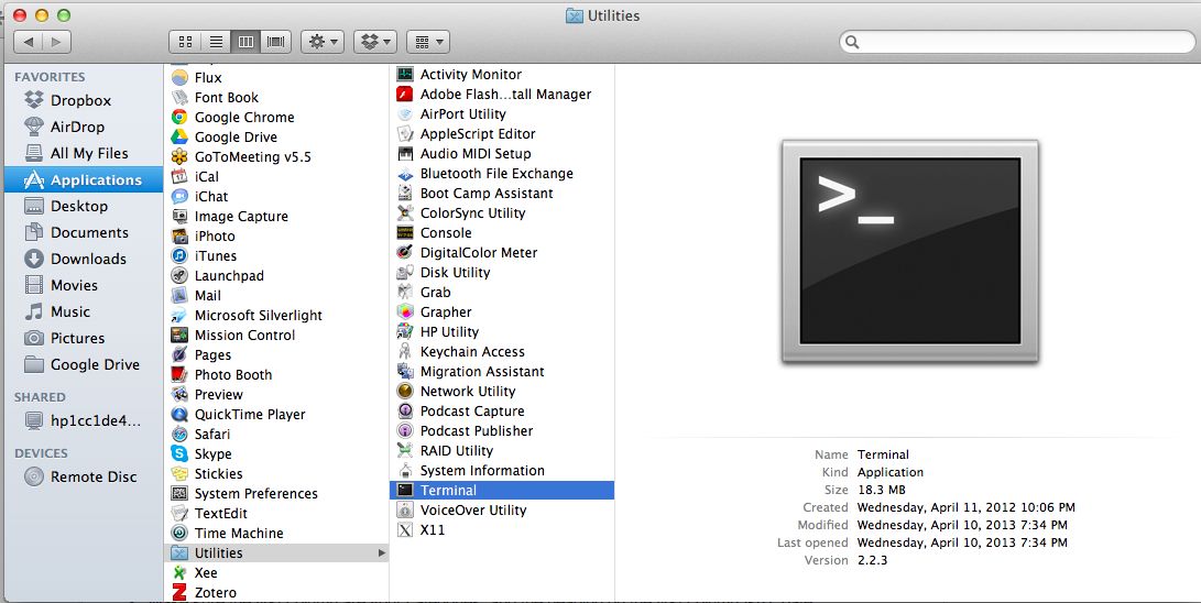 PC users, you’re on your own. Just kidding. Try this set of instructions for opening the terminal in Windows 7.
